
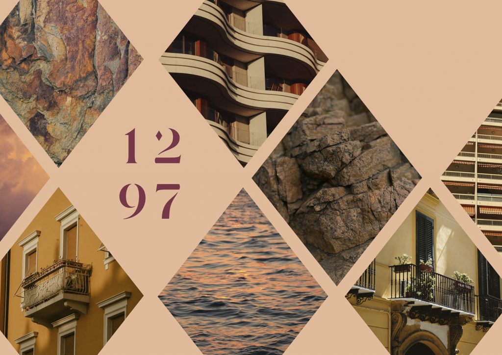
Brand identity / Print / Website / Art Direction / Copywriting
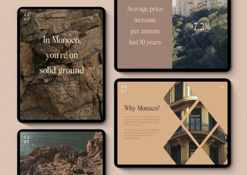
In a principality where space is scarce and demand is perpetual, Monaco stands as one of the world’s most resilient and desirable real-estate markets. With limited supply and enduring international demand, its property market has historically demonstrated strong long-term resilience.
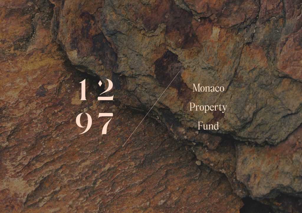
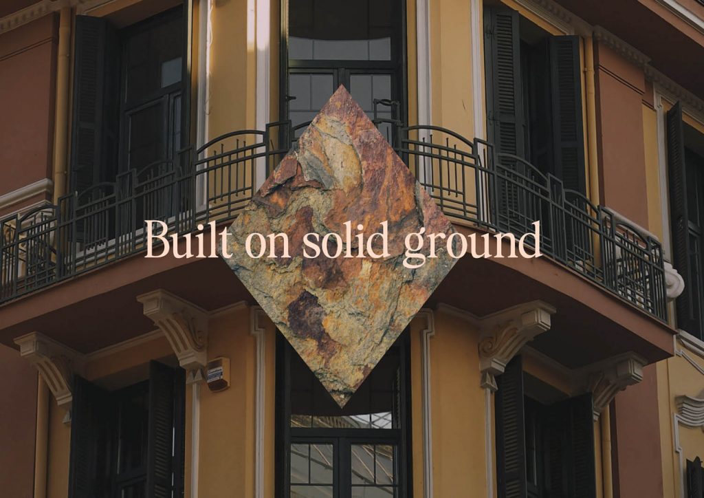
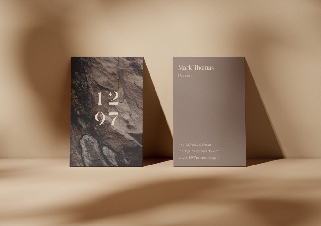
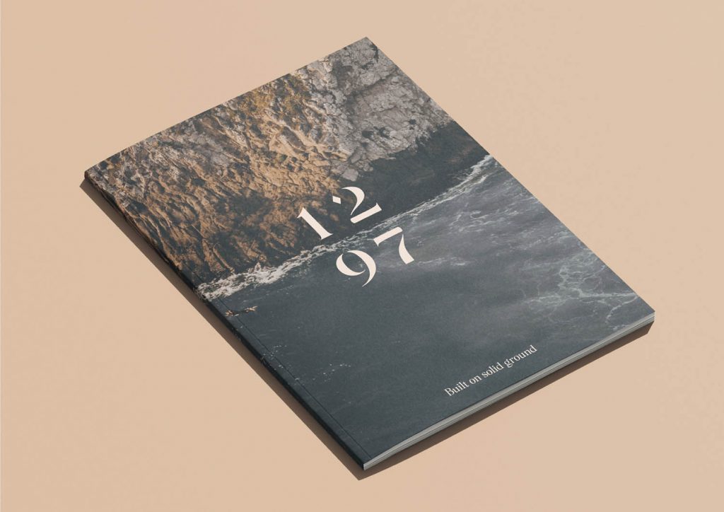
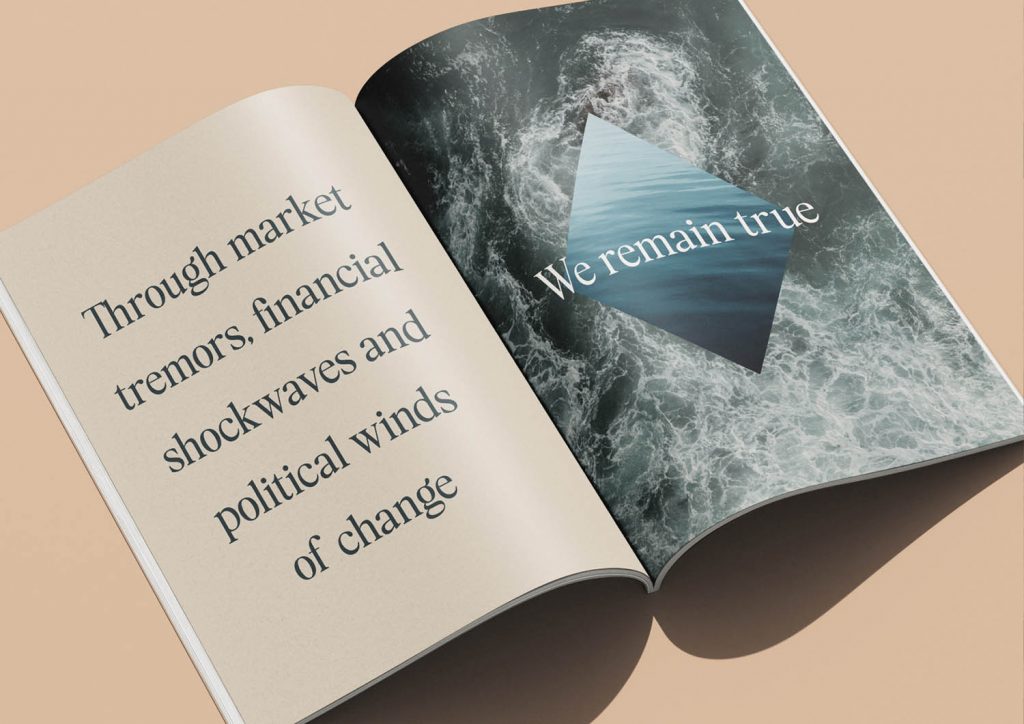
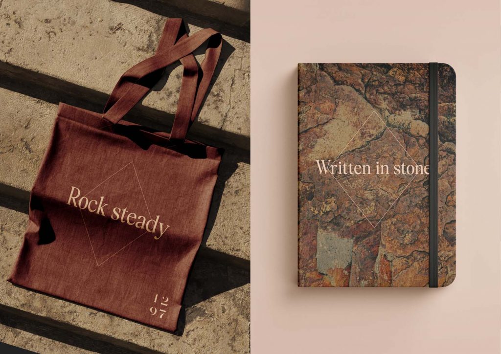
We reflected these rock solid qualities in the branding and borrowed the diamond from Monaco’s coat of arms to act as a symbol of quality, strength and timelessness. The warm, monochrome colour palette provides sophistication and evokes the area’s geology, whilst the name derives from the founding year of Monaco, signifying heritage and longevity.
